Google Question of the Day
Question of the Day is one of the most played Actions in the world and the highest-rated on Google Assistant. Its success is largely due to the simplicity of its approach: one question a day. A question that can cover a variety of topics, such as Science, Arts and Entertainment, General Knowledge, and more. They're available on various platforms, including Assistant, Alexa, and in app format. For this project, we were asked to create a scalable, attractive, and consistent visual identity for the product.
The Project
Putting a face to that familiar voice
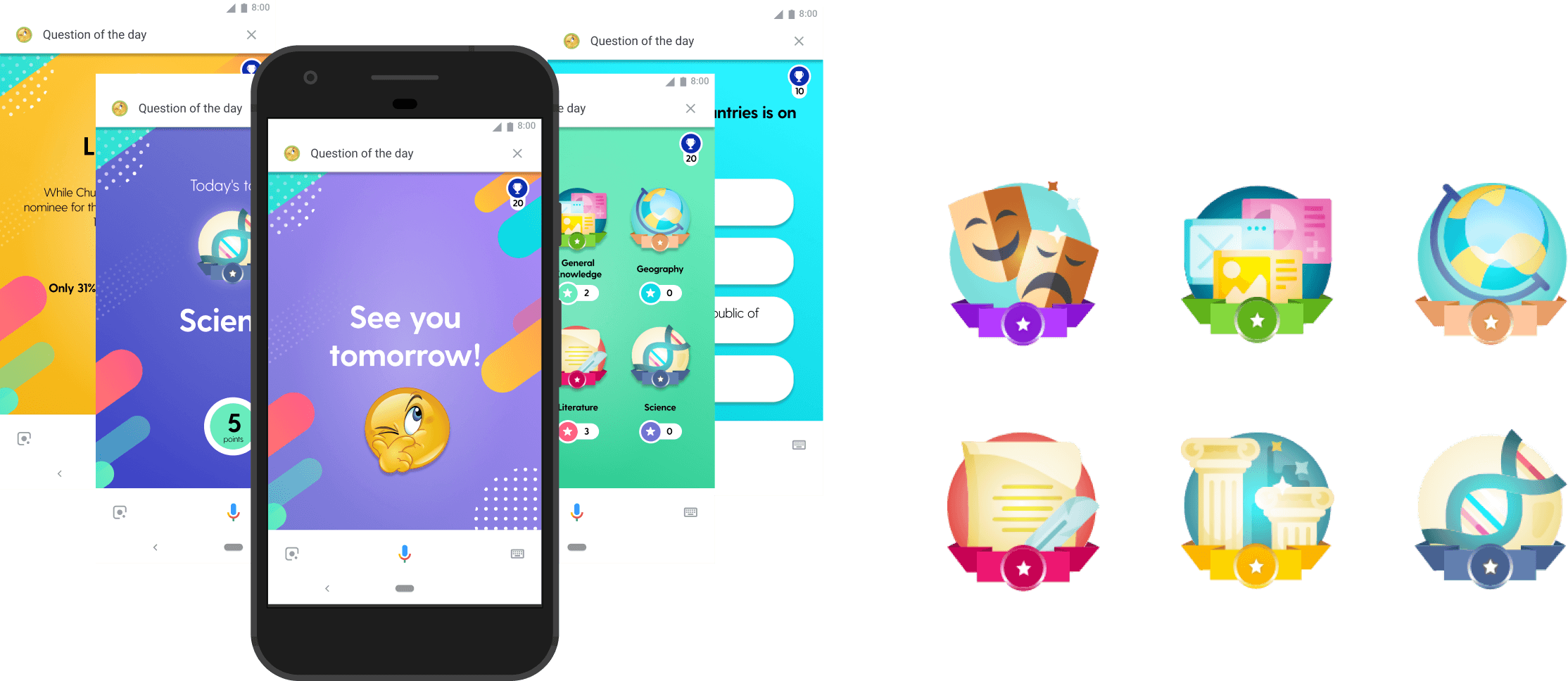
We were asked by Google to create the visual identity from scratch, design the graphical interface, and implement it on the front-end. Additionally, the project also included integrating our visual design into a reusable interface for other platforms. Question of the Day is a quiz with one daily themed question and covers six topics in total: literature, arts and entertainment, science, history, and geography. Each correct answer earns you overall points and badges for each topic.


The Challenge
If I have nothing, I have the whole world
The action is relatively rigid; you can't apply much creativity. The biggest challenge was making this limited design space shine without becoming cluttered. There was also a shortage of visual brand direction or assets to work with, and we didn't have the time or budget to dive deeper. There was no way to develop a complete branding project, so we started from scratch, with very little reference beyond a conversation with the partners about what they wanted to see.
The Process
Straight to the point and with a clear objective
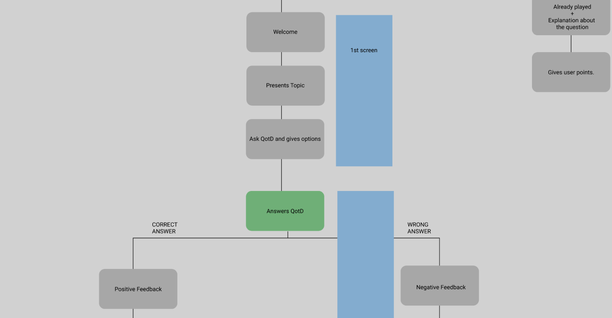
We performed a setup and a small technical discovery to mitigate risks. We mapped the existing product structure from the user's perspective, using conversational flows as a format, and provided a perspective the client hadn't yet had on the product. From there, we compiled a list of screens and began designing. We focused on simplicity and objectivity, while maintaining a striking and attractive visual style. Each theme was assigned a color, and we experimented extensively until we achieved a look that coordinated well with each other without cluttering the screen.
The Solution
Good design, without a doubt, simplifies.
Vibrant colors, simple graphic elements, positive/negative animations for feedback, point statistics, and medals. This was the recipe for the game's success.
We invested heavily in a simple visual design concept: vibrant colors to aid recall after a game session and graphic elements that could be transferred to any interface. The solution came from having different color screens for each theme. Additionally, we added positive/negative animations for response feedback and created a new screen with point statistics and medals in one place. The product became more engaging and interactive.
Results
The best of the results
XXX
"Outracoisa* could really understand our core needs and deliver a consistent identity with stunning visuals for our product and is helping us consolidate as a top notch product in the voice space!"
Joel Wilson - CEO Matchbox